Colors & Fonts
Configure the colors, fonts, and typography to be used across your website.

Website >>> Appearance >>> Customise >>> Colors & Fonts
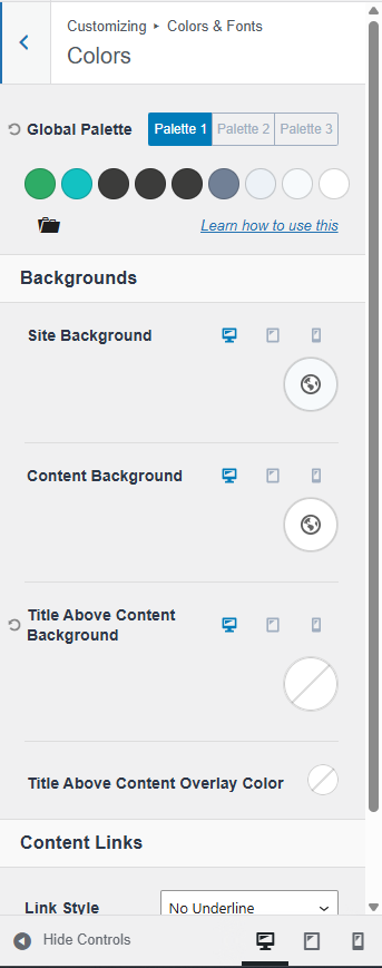
Colors
You can change the active palette in the Customise tool, but keep in mind: this only swaps the 9 predefined colors. Their order matters. It’s generally best to stick with the original sequence provided by the theme, as it’s designed to maintain visual harmony.
The palette is divided into three key sections:
- Accent Colors (First Two Colors)
These are used for prominent highlights such as buttons, links, and other attention-grabbing elements. - Contrast Colors (Next Four Colors)
These colors create a subtle hierarchy, especially in typography, to enhance readability and structure within your content. - Background Colors (Last Three Colors)
These define gentle visual differences between sections of a page or post, helping to organize content and improve flow.

The color palette isn’t just a random collection of colors you might want to use on your site. Each one has a specific role in the overall design system.
The Colors panel
The colors in your palette are already integrated throughout your site, shaping its subtle aesthetic and look and feel. They form the “skin” of your site. When you adjust the color palette, you’re not just changing isolated elements, but the base design of your site, as these colors are used consistently across various components to maintain visual coherence and ensure that your site stays aligned with your chosen style.
To create a cohesive and flexible design system, the color palette is structured into 9 purposeful roles:
1. Accent – The primary color used for key highlights and interactive elements.
2. Accent (Alt) – A variation of the accent color, often used for hover or active states (think of what happens when you hover over the accent color).
3. Strongest Text – Used for high-emphasis text, such as headlines.
4. Strong Text – Used for primary body text.
5. Medium Text – For secondary content or less prominent text.
6. Subtle Text/Borders – Ideal for captions, helper text, or dividing lines.
7. Subtle Background – A light background that ensures strong text remains legible (light enough that strong text is readable).
8. Lighter Background – Even lighter than the previous, suitable for areas with medium text (light enough that medium text is readable).
9. White – The lightest background for maximum contrast (or very close to white).
By consistently applying these color roles throughout your site, you maintain a unified visual language and make it very easy to tweak the system later on. If you need additional or independent colors beyond this palette, you can add them through Kadence Blocks Controls. There, you can define unlimited custom colors for easy access directly within the block editor.
Buttons
You can change the appearance of buttons throughout your site. Whenever you add a new button to a page, it will use the configuration set in the Customizer by default unless specified differently in the Block Settings.
The Buttons Panel
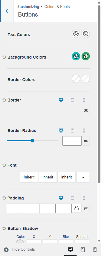
These are the available parameters:
- Text Colors: It allows you to set an initial color and hover color for your button text.
- Background Colors: It allows you to set an initial color and hover color for your button background.
- Border Colors: It allows you to set an initial color and hover color for your button border.
- Border: It allows you to set and use a border on your buttons.
- Border Radius: It allows you to set the border radius on your buttons.
- Font: It allows you to specify a font, font style, and font size for your button.
- Padding: It allows you to add padding to your button for desktop, tablet, and mobile devices.
- Button Shadow: It allows you to set a shadow around your button.
- Button Shadow Hover State: It allows you to set a hover shadow around your button.
Typography
The Typography Settings control the overall appearance of text across your website, including font families, font colors, font sizes, and additional font styles.
The Typography Panel
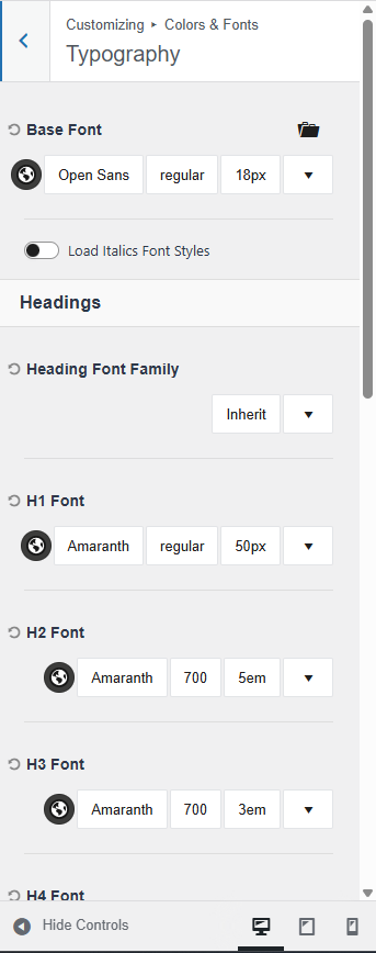
Base Font
This defines the default font used throughout your site, including common elements like paragraph text and navigation menus.
Heading Font Family
This setting applies a specific font to all headings (H1–H6) across your site. By default, individual headings are set to inherit this global font. However, you can override any heading by manually selecting a different font for that specific element.
To fine-tune your typography:
- Use the Color Picker to choose a font color.
- Use the Font Selector to apply a specific font family.
- Adjust the Font Weight to control thickness (e.g., light, regular, bold).
- Finally, you can define a Font Size and adjust additional font settings.
Remember to click the “Publish” button (on the top left of the screen) to register any modifications.