Footer
Create your website desktop and mobile footer.

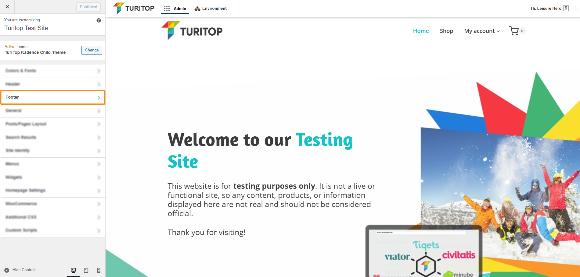
Website >>> Appearance >>> Customise >>> Footer
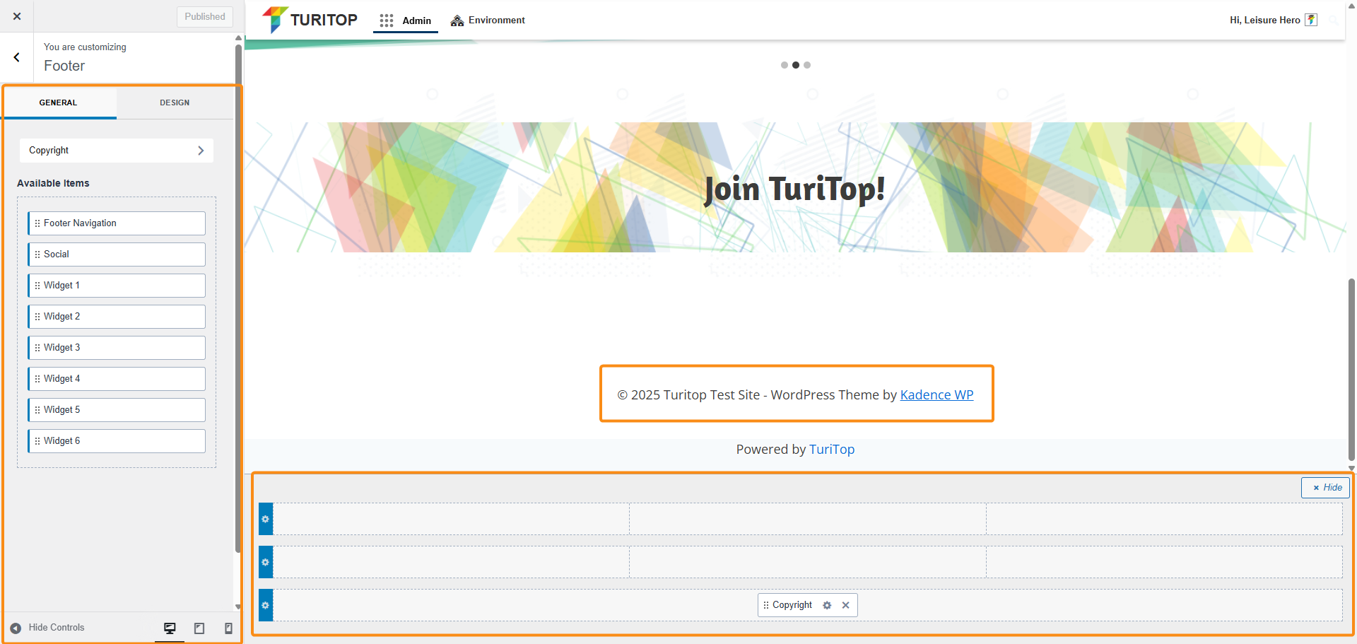
In the first screen of the Footer section, you will find the General and the Design tabs.
General Settings
In the General tab, you will have diverse available items to drag and drop into the structure of the Desktop and Mobile versions of the footer, as shown in the screenshot below.
The General tab of the Footer section.
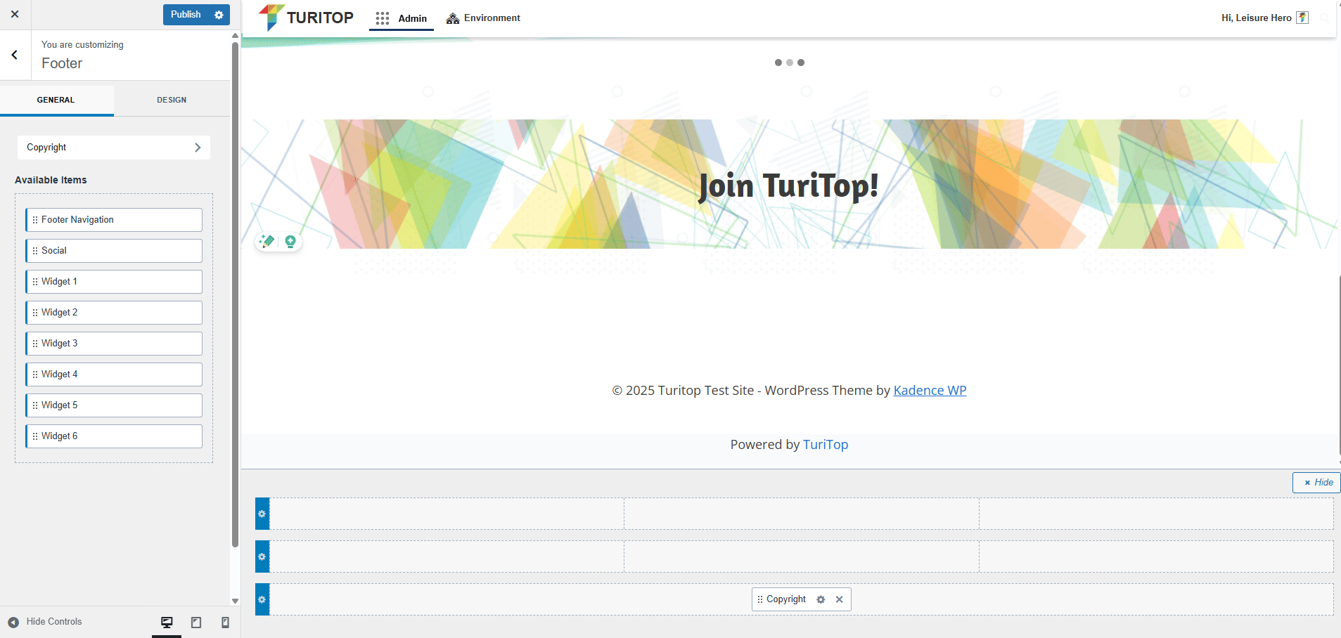
Within the editor, you can see in real time how the Footer in your site appears and make any changes you want without leaving this screen.
Furthermore, if you click on any element that is already configured in one section of the footer, you will be able to edit and fine-tune it to your needs:
Example: modifying the content for the “Copyright” element.
Design Settings
In the Design tab, you can set up your footer background color and enable or disable the “Keep footer on bottom of screen” option.
Activate this option if you want to be sure that your Footer is always the last element of the page, replacing the position of other possible layouts or elements.

You can find more information about all the available elements and advanced configuration for your footer in the official Kadence documentation.