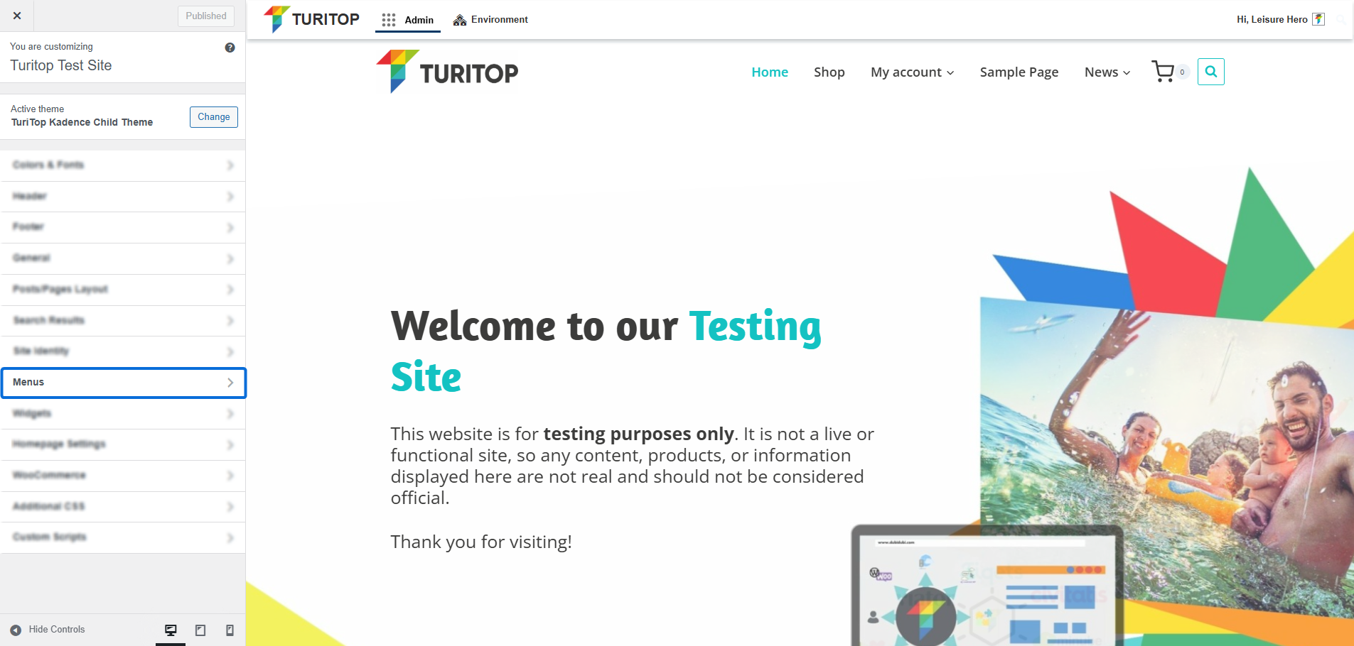
Menus
Configure navigation menus for your website.

Website >>> Appearance >>> Customise >>> Menus
Configure your Menus
The Menus section of the Customiser allows you to preview changes to your site’s navigation menus in real time.
However, it is highly recommended that you use this feature once you have previously configured each menu in the Appearance >>> Menus section. Learn more about this in the Menus tutorial of our Academy!
Editing your Menus
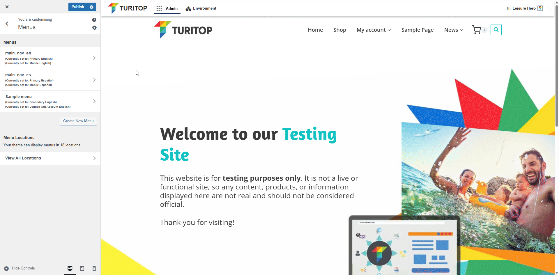
To edit an existing menu, select it from the list. You will see that its current items will appear in the left sidebar. You can modify existing items, use drag and drop to rearrange them, add new items, and assign the menu to one or more display locations:
Editing a menu.
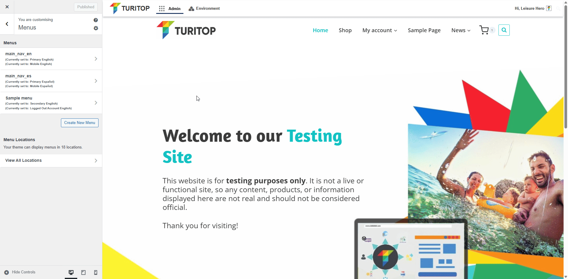
Creating New Menus
In this view, you can also create new menus by clicking the Create New Menu button. In the example below, we’ll create a simple menu with a single item and assign it to the Primary Menu location.
Creating a new menu.
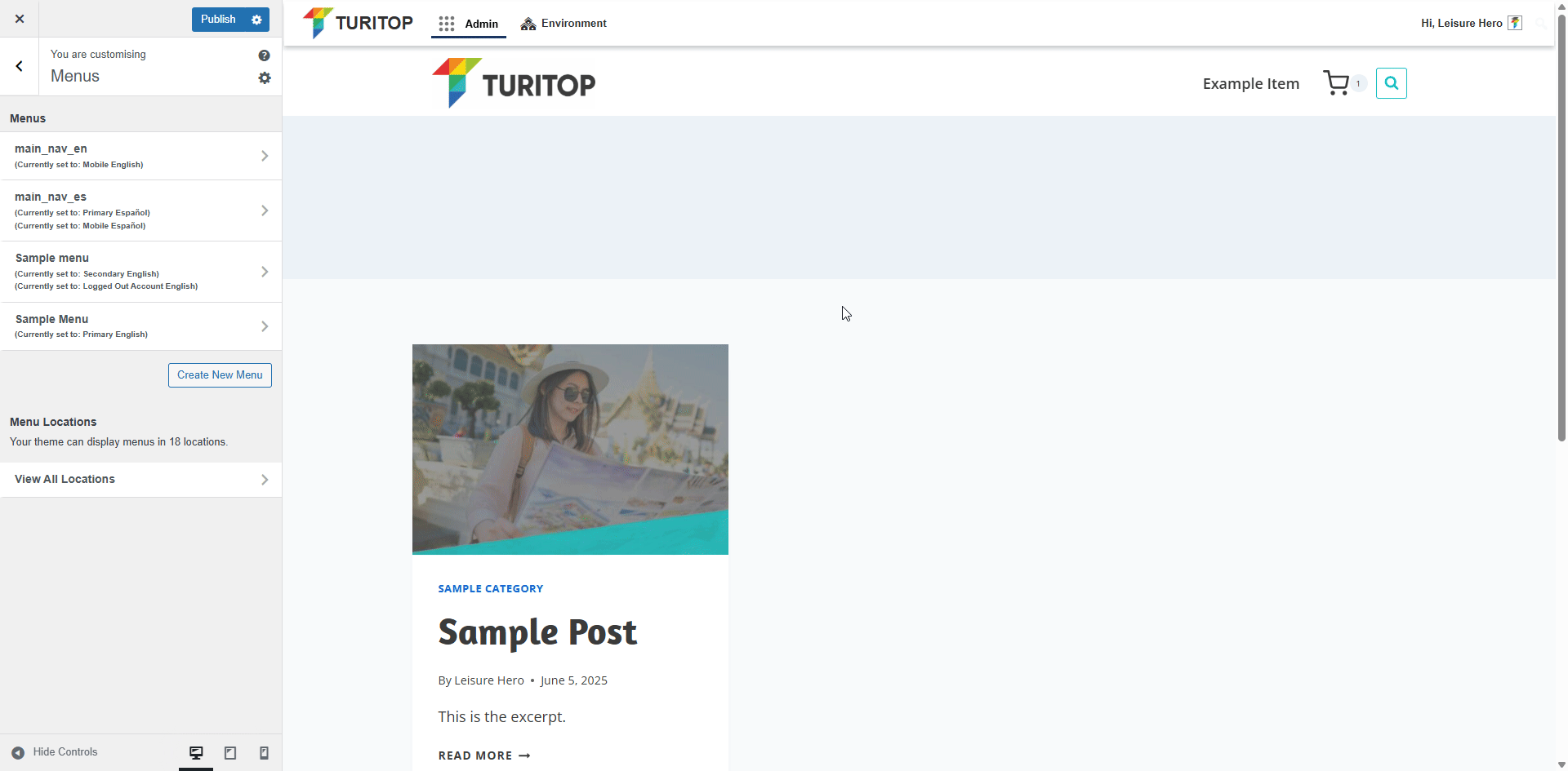
View Menu Locations
If you click on the View Menu Locations button, you will see all available positions for your menus, and you can select a specific menu for each one. Also, from this view, you can edit the menu you are assigning to the location:
The “View Menu Locations” option.
Customising the Menu Design
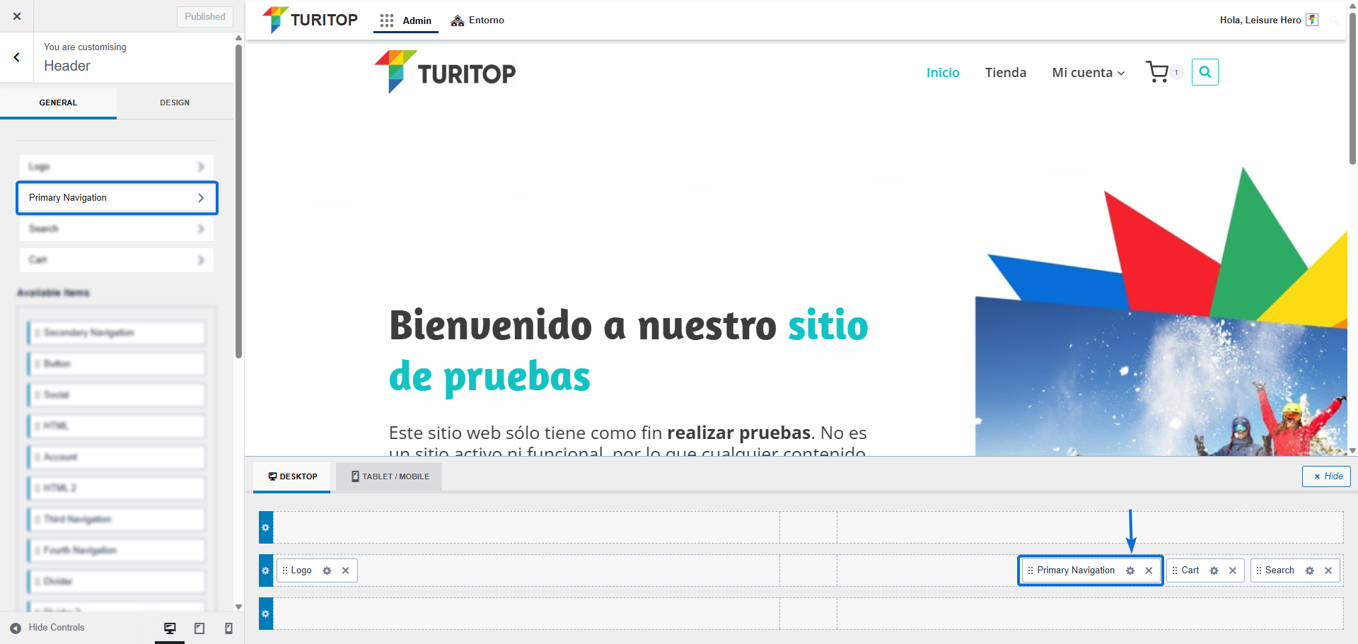
Once you insert a menu in some section of your website, for example, when you put the primary navigation in the Customise >>> Header section, you can change the design and style of your menus. To change the design of a menu, you will have to click on the cog wheel icon located on the right of the element you want to modify (bottom of the page) or on the element itself in the left sidebar. In the case of this example, the “Primary Navigation”:
Accessing the menu design customisaiton.
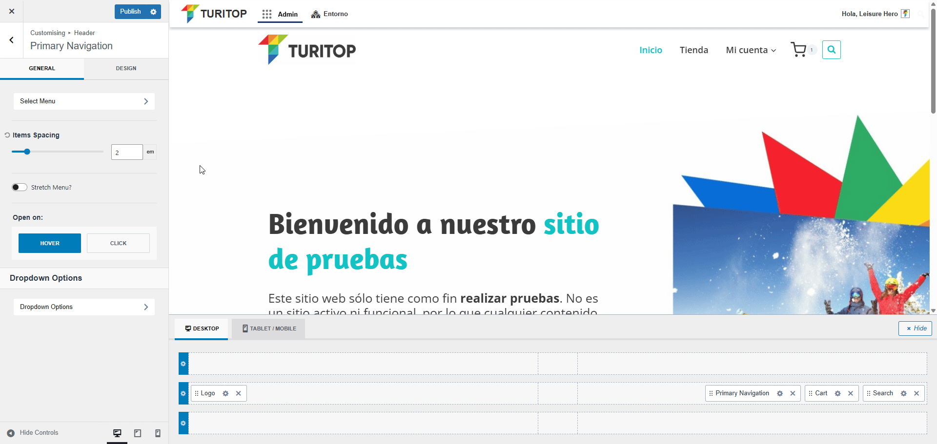
In the next screen, you will see two tabs: General and Design.
From the General tab, you can:
- Click on Select Menu to set up an already created menu or create a new one.
- Set the Items Spacing.
- Configure the Stretch Menu option and, if enabled, set the Fill and Center Menu Items parameter.
- Establish if the drop-down items on menus will open on Hover or on Click.
- Set diverse Drop-down options, such as the Reveal effect (None, Fade, Fade Up, Fade Down), the Width, and the Items Vertical Spacing.
The General Options for Primary Navigation.
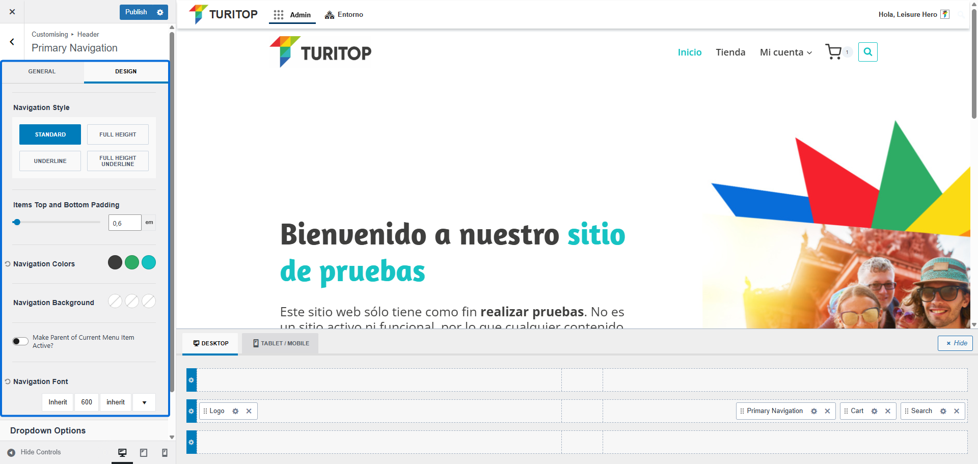
From the Design tab, you can:
- Set the Navigation Style to Standard, Full Height, Underline, or Full Height Underline. If set to Standard, you will also be able to control the Items Top and Bottom Padding.
- Configure the Navigation Colours, Navigation Background, and Navigation Font.
- Make Parent of Current Menu Item Active (e.g., if the user is on a child item in a drop-down menu, its parent item will be marked as active).
Design tab for the Primary Navigation.

As with the Primary Navigation element, you can configure the general settings and design of almost every other element by clicking on the cog wheel icon or in the name of the element.