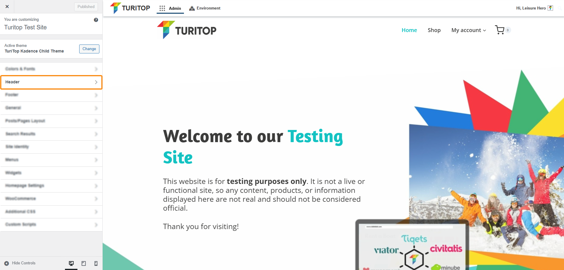
Header
Create your desktop and mobile header for your website.

Website >>> Appearance >>> Customise >>> Header
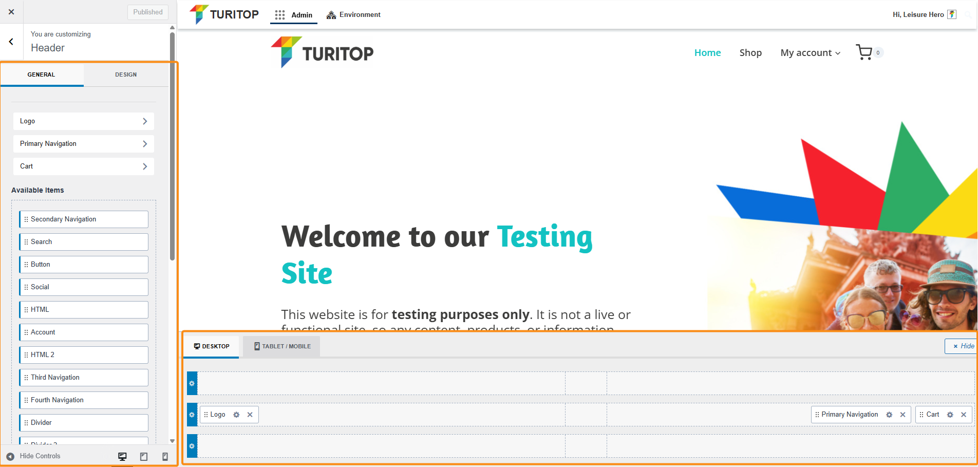
In the first screen of the Header section, you will find the General and the Design tabs.
General Settings
In the General tab, you will have diverse available items to drag and drop into the structure of the Desktop and Mobile versions of the headers, as shown in the screenshot below.
The General tab of the Header section.
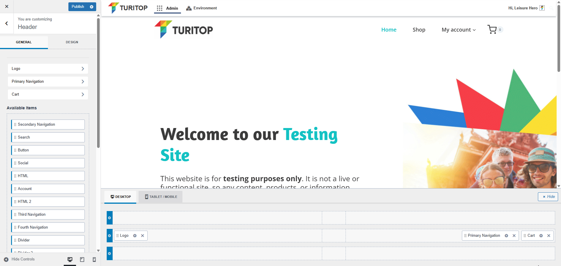
Within the editor, you can see in real time how the Header in your site appears and make any changes you want without leaving this screen.
Furthermore, if you click on any element that is already configured in one section of the header, you will be able to edit it to your needs:
Example: modifying the “Items spacing” for the “Primary Navigation” element.

You can find more information about all the available elements for your header in the official Kadence documentation.
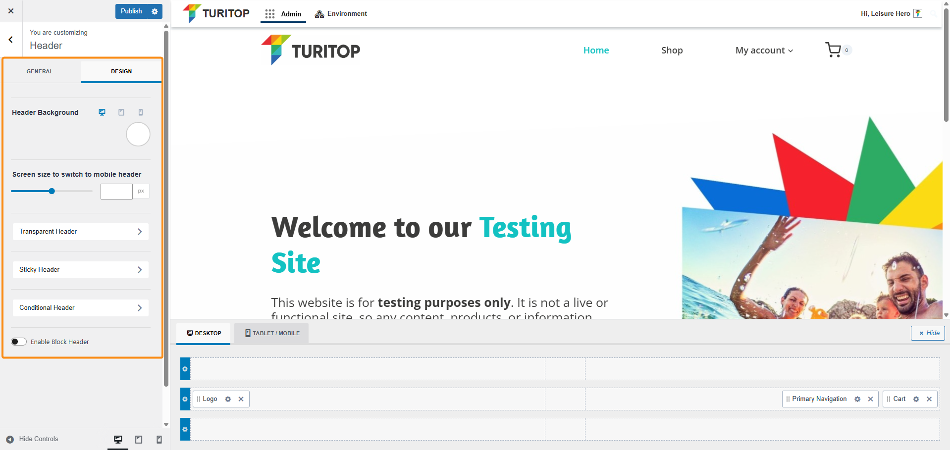
Design
The second tab of the Header sections refers to its Design. Here you can set your background color and also the screen size to switch to the mobile version of the header.
The Design tab for the Header.
Other Settings
On both tabs, you have the following configurations available:
- Transparent Header: It allows you to set your header to transparent for blending it with your content.
- Sticky Header: This option will make your header sticky at the top of the page, so it will be shown when users navigate up and down through your site.
- Conditional Header: If you need variations or completely different headers for specific sections of your site, here you can configure as many extra headers as you want.
- Enable Block Header: This option allows you to select a previously created Header Block as your header. As this is an advanced feature, please refer to the official Kadence documentation.
For the first 3, you will see the General tab, where you can enable/disable them, and then you can switch to the Design tab to modify the colors of its elements.