WooCommerce
Personalize different aspects of the shop engine.

Website >>> Customise >>> WooCommerce
WooCommerce Customisation
In this section, you can customise various aspects of your shop, including product and catalog layouts, add-to-cart behaviour, store notices, and more.
Please note that these settings apply exclusively to your Shop Page and will not affect any custom pages or posts you may use to display products or other parts of your shop flow.
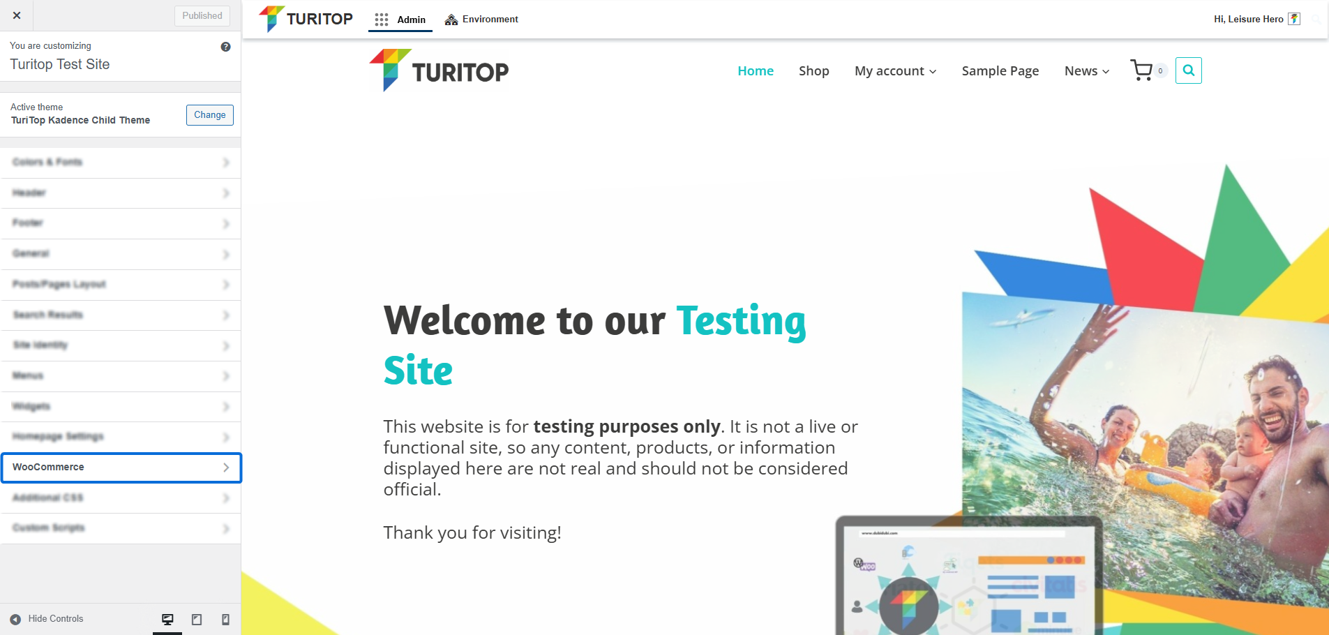
Store Notice
You can add a store-wide alert/banner notice to announce sales, shipping delays, or special events to your customers. Just check the “Enable store notice” box and configure how it’s displayed with Store Notice Placement:
The Store Notice configuration.
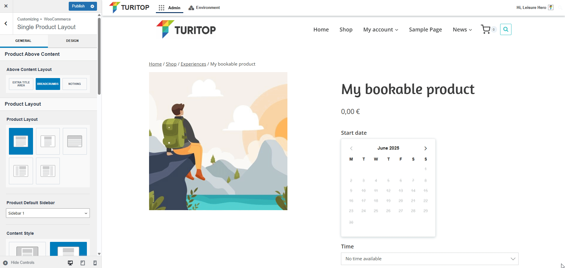
Single Product Layout
In this section, you can configure the Layout for your individual products’ pages in the same way you configure your Posts/Pages Layout.
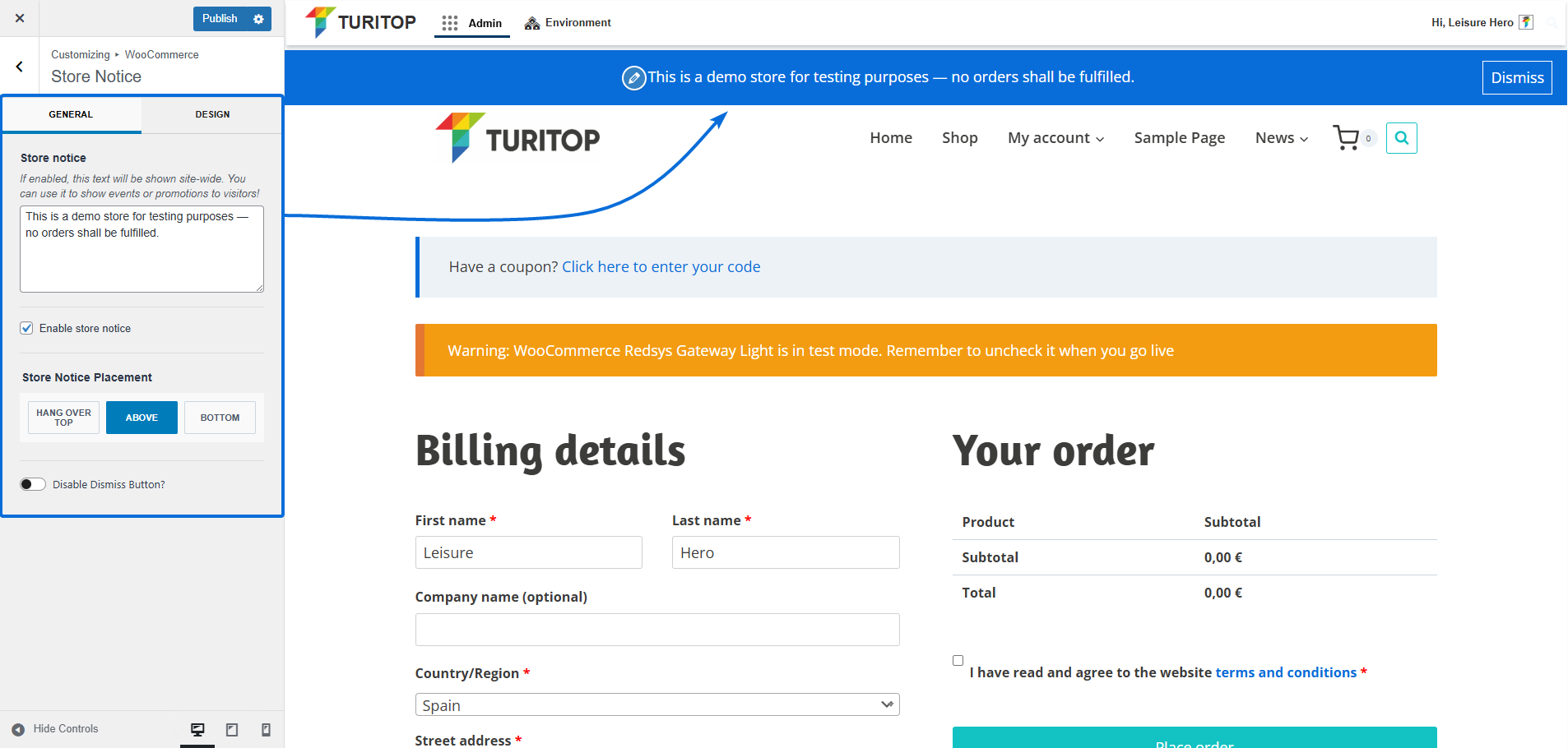
Product Above Content
The first section refers to the information presented above the Product Content. Only the Breadcrumbs are selected by default, but you can also configure it to show Nothing or to add an Extra Title Area on which you can show the breadcrumb, the category, and the title of the product:
Configuring the Above Content Layout.
Product Layout
As well as the Posts/Pages Layout options, the Product Layout has the following parameters:
- Product Layout: Normal, Narrow, Fullwidth, Left Sidebar, or Right Sidebar.
- Product Default Sidebar: Sidebar 1 or Sidebar 2.
- Content Style: Boxed or Unboxed.
- Content Vertical Spacing: Enable, Disable, Top Only, or Bottom Only.
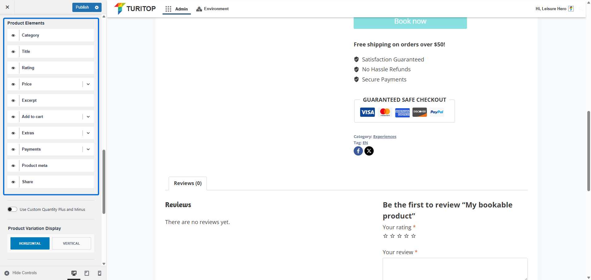
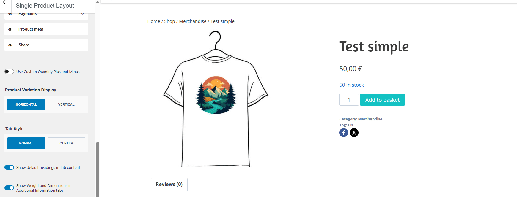
However, the Product Elements section has its own elements related to the product information, which can be shown or hidden:
- Category: A linked text for the category/categories of the product.
- Title: The title of the product.
- Rating: The rating of the product.
- Excerpt: The excerpt of the product.
- Add to Cart: The add to cart button, which can be set between Normal, Medium-Large, or Large Size.
- Extras: If enabled, you can set a custom text with up to 5 features in a list with icon mode, which will be displayed below the Add to Cart or Book button.
- Payments: If enabled, this option displays a box below the Add to Cart, Book, or Extras buttons (if applicable). The box includes a custom title and a list of selectable payment method icons (e.g., Stripe, VISA, Mastercard, etc.).
- Product Meta: If enabled, it will show the category or categories and tag or tags at the end of the content.
- Share: If enabled, sharing icons will appear at the end of the content, allowing users to easily share the page on social media platforms.
The Product Elements.
The next option is the Use Custom Quantity Plus and Minus checkbox. If enabled, it will show a different field for the quantity. Take into account that this is only available for simple (e.g. physical) products:
The “Use Custom Quantity Plus and Minus” option.
Next, you will be able to configure the Product Variation Display (Horizontal or Vertical) if you have any product variations (for example, different colors of a shirt).
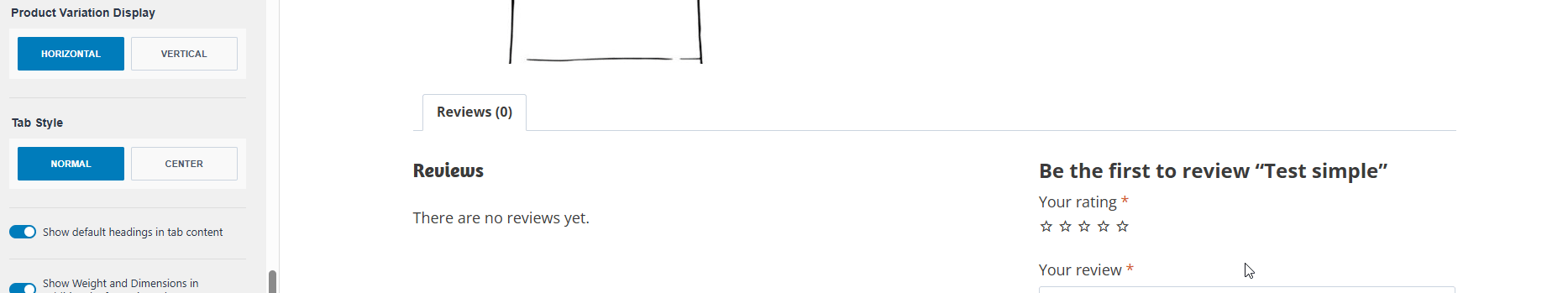
The Tab Style parameter establishes if the tabs of Reviews and Additional information should be centered or not:
The “Tab Style” parameter.
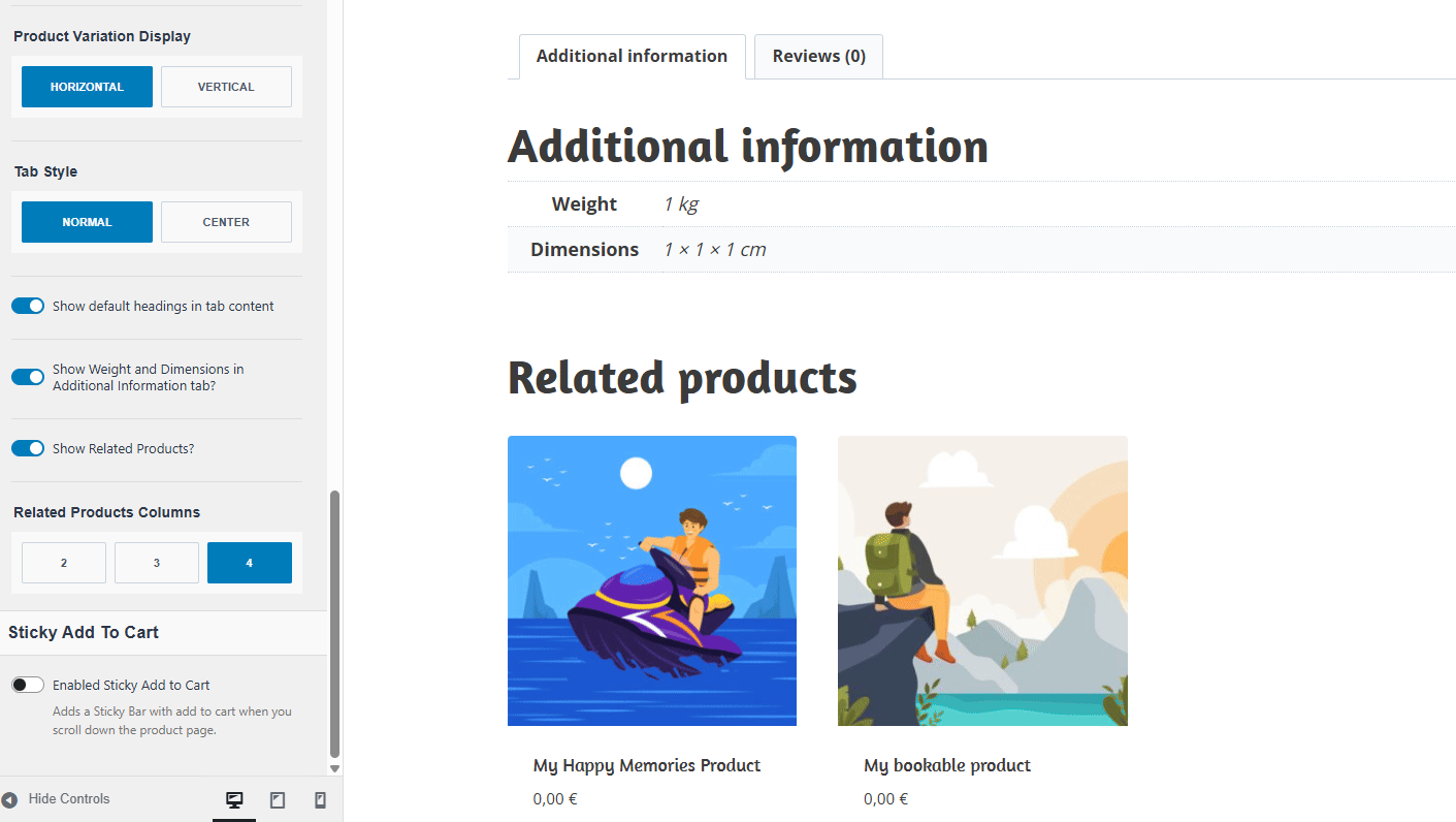
Finally, you have the option to configure these parameters:
- Show default headings in tab content: If enabled, the heading of each tab will also be displayed within the tab’s content area.
- Show Weight and Dimensions in Additional Information tab: If enabled, and the product has defined weight and dimensions, this data will be displayed in the “Additional Information” tab.
- Show Related Products: If enabled, a list of related products will appear below the main product content.
- Related Products Columns: Select the number of columns (2, 3, or 4) to display related products in a grid layout.
Configuring the parameters for the tabs and related products.
Additionally, you can check the “Enabled Sticky Add to Cart” box at the end to show a sticky header when the user is scrolling through the product page:
The “Sticky Add to Cart” parameter.
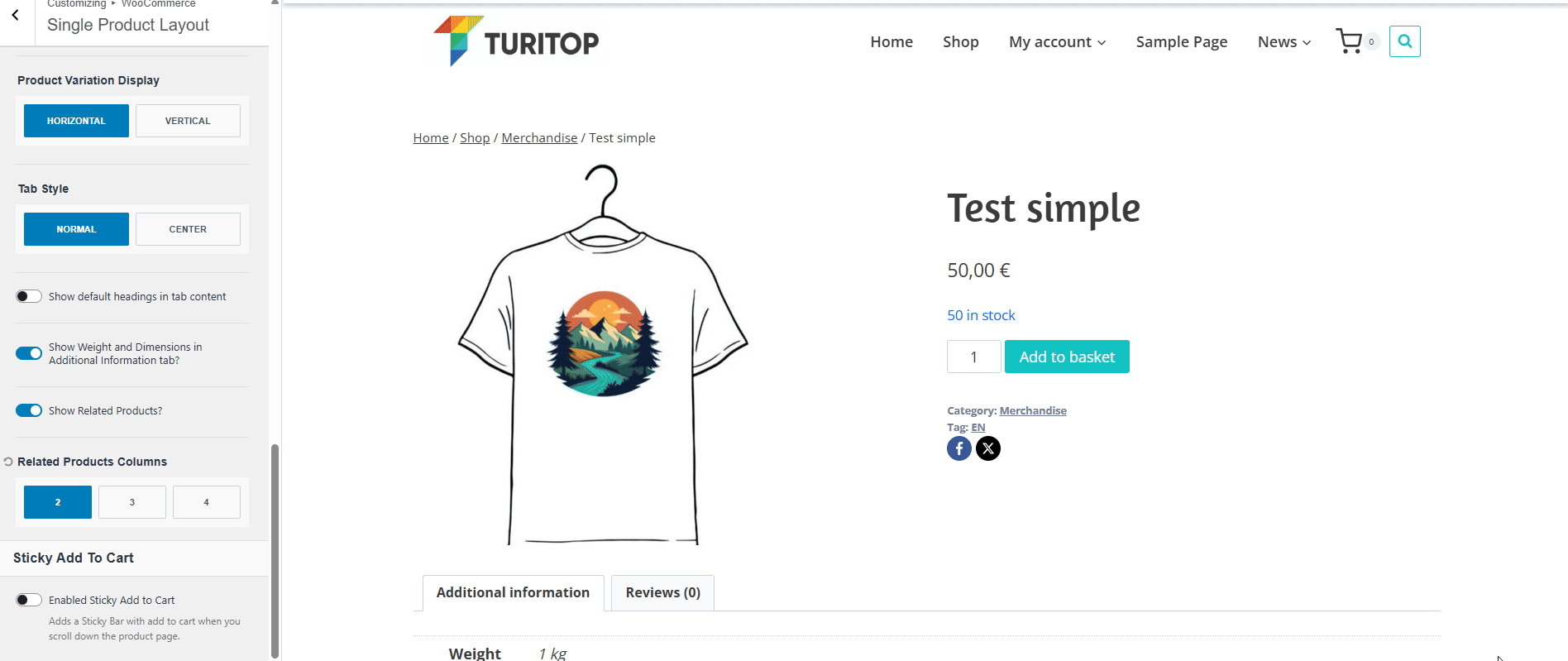
If enabled, you can configure the Sticky Placement to the “Top” or the “Bottom” of the product page, and also “Enable for mobile” to be shown (or hidden) on smaller devices.
Product Catalog
The Product Catalog section allows you to customize the default layout for the main page of your shop. This is where all of your products are shown and is very similar to the Archive layout. For example, the Archive Title and the Archive Layout for the catalog have the same parameters. However, there are a few more options to customize the list of your products.
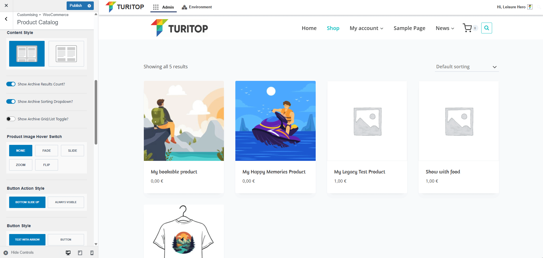
Content Style
- The Archive Results Count.
- The Archive Sorting Dropdown.
- The Archive Grid/List Toggle.
As per the boxes of the products, you can:
- Configure the Product Image Hover Switch to None, Fade, Slide, Zoom, or Flip effects.
- Configure the Button Action Style to Bottom Slide Up or Always Visible.
- Configure the Button Style to Text with Arrow or Button.
The Content Style parameters for the Product Catalog.
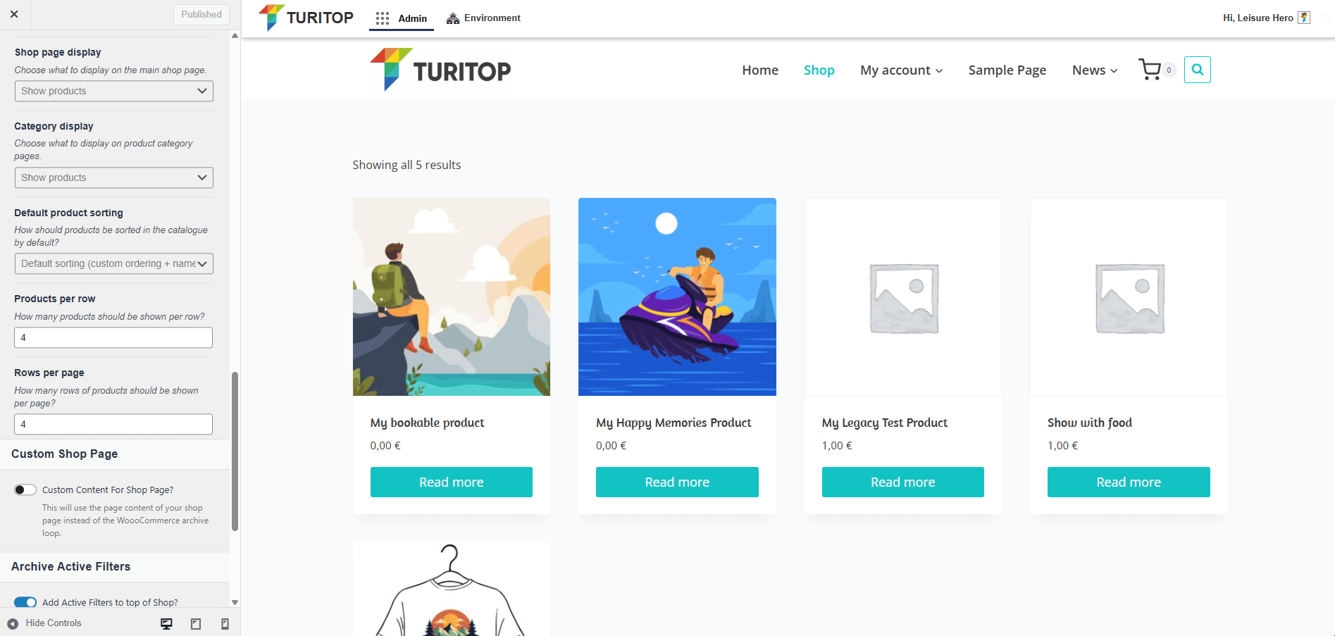
Display Options
The next options allow you to customize the Display Options for your catalog:
- Shop Page Display – You can choose what to display on the main shop page: products, categories, or categories and products.
- Category Display – You can choose what to display on product category pages: products, subcategories, or subcategories and products.
- Default product sorting: You can define how products should be sorted in the catalog by default.
- Products per row -You can define how many products should be shown per row.
- Rows per page – You can define how many rows of products should be shown per page.
Display Options for the Product Catalog.
Custom Shop Page
To create a fully custom Shop Page, enable the Custom Content for Shop Page option. This replaces the default WooCommerce product archive loop with the content you’ve added directly to your Shop Page.
The Custom Shop Page checkbox.
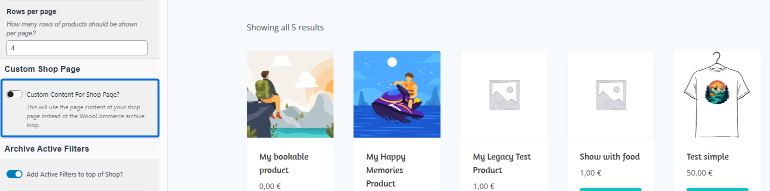

Remember to set the correct shop page you want to use on the Shop Page Settings of the Configure My Shop section.
Archive Active Filters
In this section, you can show or hide the following parameters:
- Add Active Filters to top of Shop.
- Show Button to Remove all Filters.
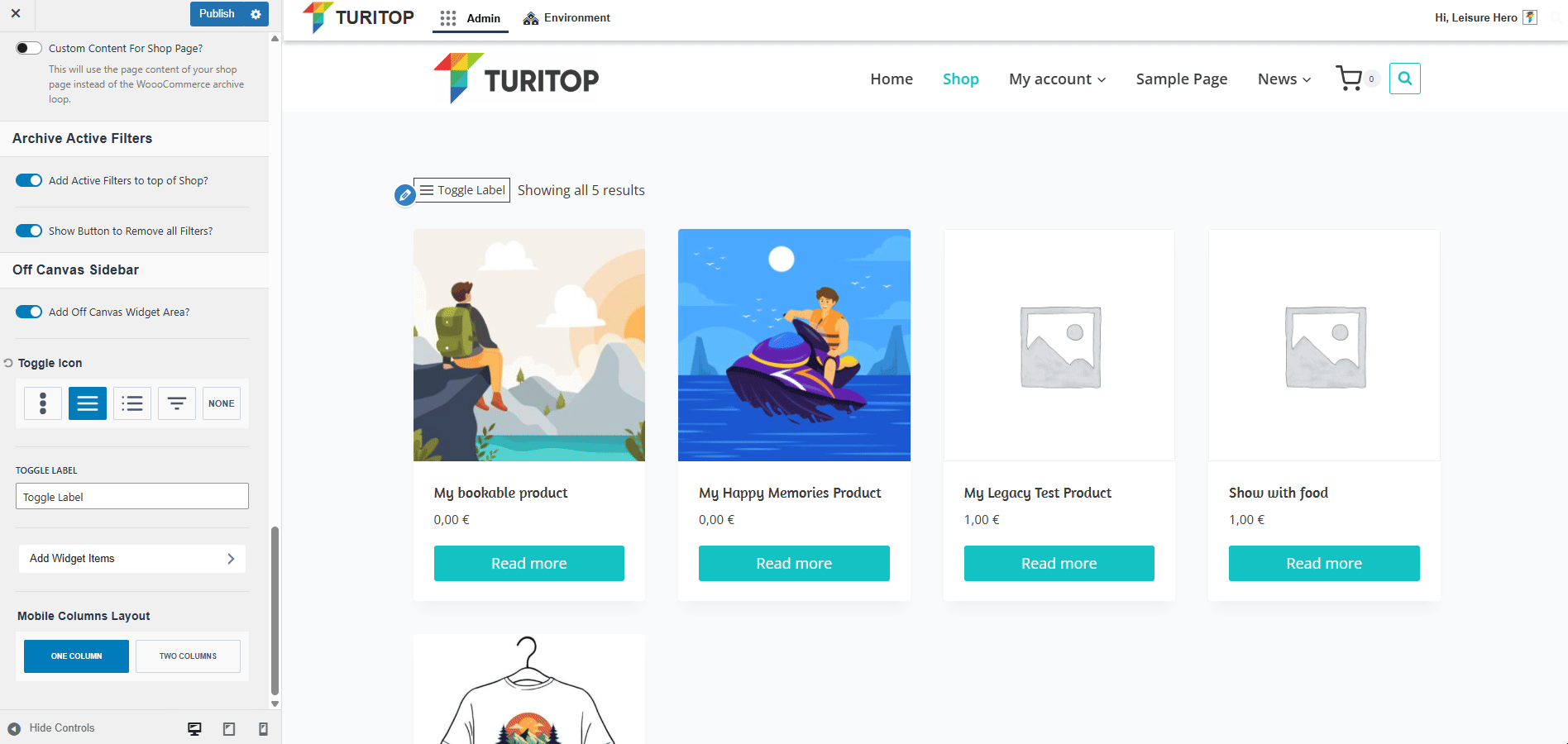
Off Canvas Sidebar
To include an off-canvas widget area in your shop, enable the Add Off Canvas Widget Area? option. It adds a customisable toggle icon that reveals the widgets placed in the Catalog Off-Canvas Sidebar widget area. Learn more about widgets and widget areas here.
The Off Canvas Sidebar options.
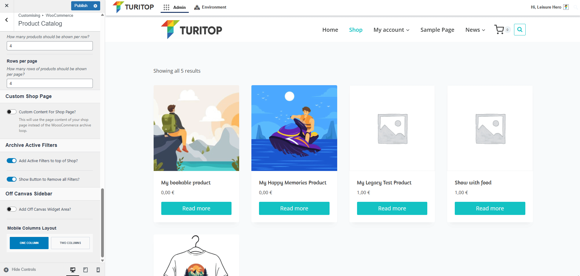
Finally, you can set up the Mobile Columns Layout to One Column or Two Columns:
The Mobile Columns Layout Settings.
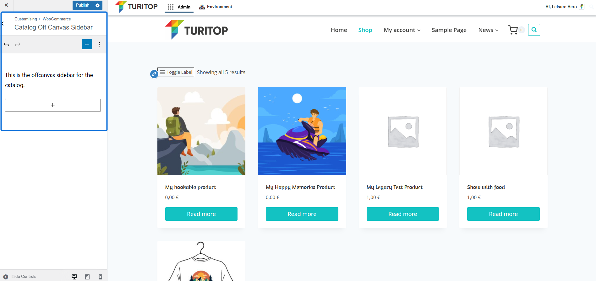
Catalog Off Canvas Sidebar
This section allows you to directly add and edit Widgets to the Catalog Off Canvas Sidebar widget area. Learn more about widgets and widget areas here.
The Catalog Off Canvas Sidebar widget area.
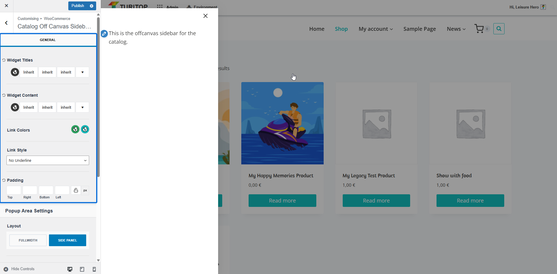
Catalog Off Canvas Sidebar Settings
In this section, you can customize the settings of the Catalog Off Canvas Sidebar.
General
In the General settings, you can configure:
- The Widget Titles and Widget Content Font Family, Style, and Size.
- The Link Colors and Link Style.
- The Padding.
Banner main
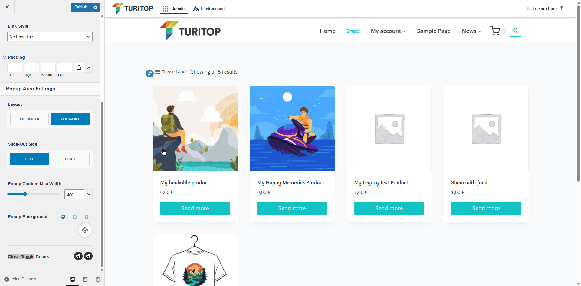
Popup Area Settings
This section allows you to customize the Popup Area that appears when you click on the toggle icon mentioned in the previous section. You can:
- Set the Layout to Fullwidth or Side Panel.
- Define if the Slide-Out Side should be Left or Right.
- Configure the Popup Content Max Width, the Popup Background color, and the Close Toggle Colors.
Configuring the Popup Area Settings.
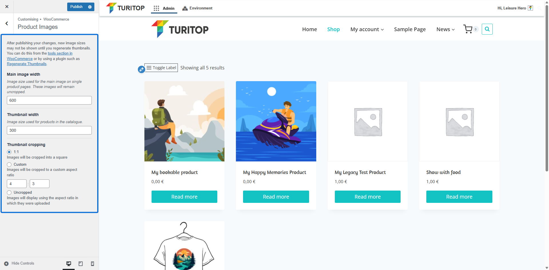
Product Images
The Product Images section allows you to control the size and aspect ratio of your product images. The following parameters are available:
- Main image width: Image size used for the main image on single product pages.
- Thumbnail width: Image size used for product thumbnails in the catalogue.
- Thumbnail cropping: Choose how the thumbnails are cropped – 1:1 ratio, Custom ratio, or Uncropped.
The Product Images parameters.
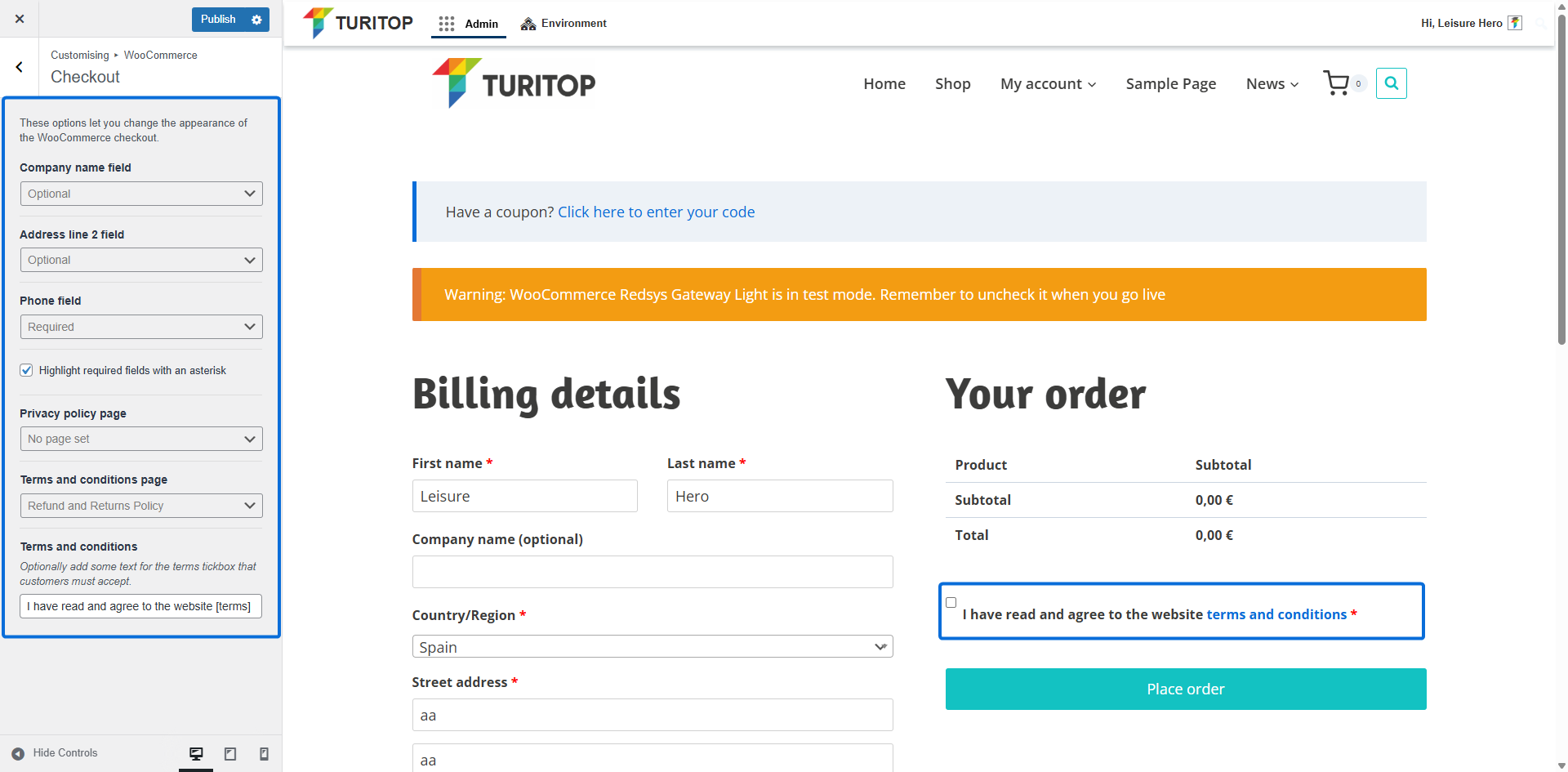
Checkout
In the Checkout Section, you can configure various aspects of the checkout page. You can:
- Choose whether the following fields are Optional or Required:
- Company name field
- Address Line 2 field
- Phone field
- Point up the mandatory fields by checking the Highlight required fields with an asterisk.
- Set your Privacy policy page and Terms and conditions page, with the option to add some text for the terms tickbox that customers must accept.
The Checkout settings.
Add to Cart Behavior
In the Add to Cart Behavior section, you can enable the option Show the cart popout on add to cart? to display a cart pop-up immediately after a user adds a product to the cart from the product listing view:
The Show the cart popout on add to cart option.
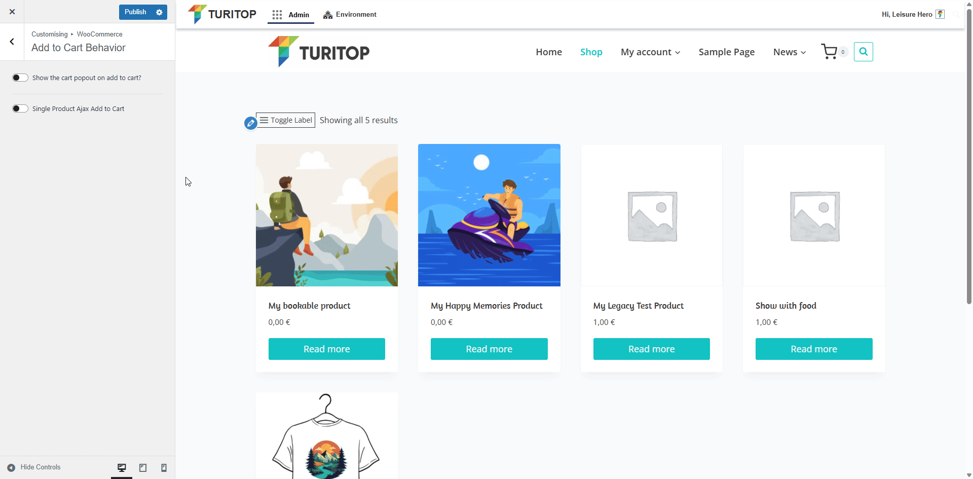
Additionally, you can enable the Single Product Ajax Add to Cart checkbox to allow your customers to include single or variable products in the cart without reloading the page. This will provide them with a smoother and faster shopping experience!